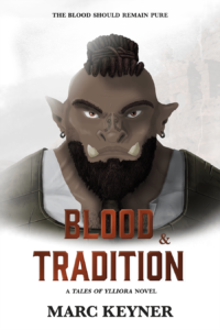
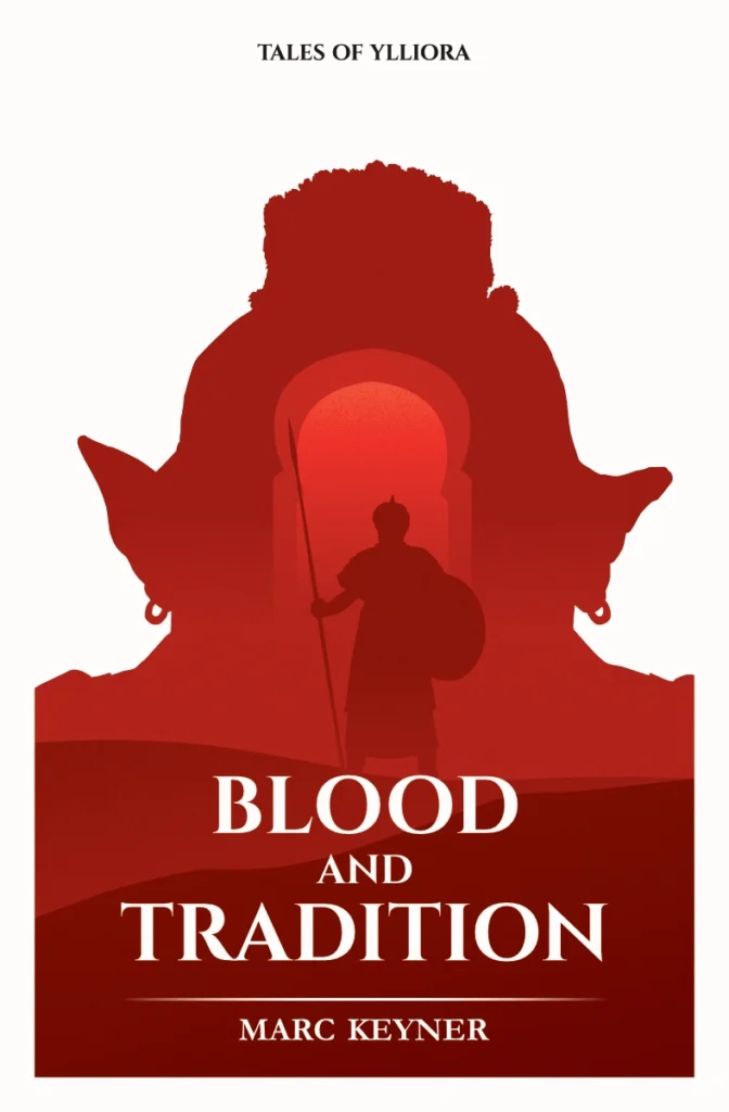
While working on the upcoming releases, I’ve spent some time reevaluating the cover design I did for Blood and Tradition. Considering I am biased toward the illustration, I still have a soft spot for this design. I wouldn’t label it as ‘bad’; however, I also realized it wasn’t good enough and needed some work.
 I love graphic design and illustrations. When I am in the neighborhood of a bookstore, I often walk in just to look at the different covers and layouts. There is some genuine admiration for the craft and I just can’t help myself try to figure out how the designer did it. The same goes for other forms of media. I enjoy the creativity and ingenuity put in the work by the artist, director; you name it. In the limited free time I have – as all free time often turns into me working – I like to dabble in my illustration and drawing software. I say dabble, but it’s a bit disingenuous. I’ve trained as a graphic designer and video editor, but I’ve never worked in the creative field to home in my skills beyond that point, and more importantly, receive the invaluable feedback from peers in real-world situations to develop them further.
Back to the cover design for Blood and Tradition. While working on the original cover, I was trying to relearn my painting skills. So I leaned more toward a portrait of my interpretation of Mos. It would be the centerpiece for the cover and after two – three weeks of working on it, I was super proud. However, after releasing the book, I heard people say they didn’t pick it up because the orc scared them, or from the get-go made them switch off to even check it out. I’ve also looked at it again, several months later after the rose-tinted glasses fell off my nose, and missed some mystery or dynamic movement. It all was so static and dead. There was just an angry orc looking straight at you. It wasn’t inviting at all to flip it over and read the description on the back.
As I was thinking up a new design, I heard the voice of a friend in the back of my head that I hadn’t spoken to in years. I remembered her being super mad about the casting for Harry Potter, because her version of Harry looked different from Daniel Radcliffe. Her version of the character had lived in her head for many years, and suddenly there was another version in the movie adaption of the books. When comparing that thought with my ‘angry, intimidating orc’ problem, I oriented toward the silhouette design. It was a design I used on multiple other occasions, but never on a book cover. It would allow people to see a clear shape, based on the description given in the book, but any other details would be the reader’s choice. When reading the book, it’s YOUR version of the character that lives through the story, not mine. There would be some reader’s agency over the appearance of the character. Sure, I know how I pictured a character, but if it’s not described, you can make it your own in your private reading session. The silhouettes would support that theory, and if done right, kick start that mind projector of all the potential adventures by just looking at the cover.
 Beside this major point, I wanted my book to look clean, standout slightly but not too much, but still have a powerful illustration on the cover. This is where the color coding for the different stories comes in. From day one, I knew I would like to have some sort of ‘colored identifier’ on the books depending on the character it followed. When Mos would be the main protagonist, I’ve always pictured a red identifier, while Phara would have more of a blueish color. This was a great opportunity to run some tests during the concept phase to see if it worked. There was a lot more ‘wow’ factor than before when asking people’s opinions, while the original only got “beautiful illustration, a bit angry though”. And my favorite part is when you put all covers side-by-side, it’s clear they belong to the same series. Plus, they are super fun (and quick) to make!
To celebrate the upcoming releases of Enemies of Old and Children of Sorrow, my debut novel Blood and Tradition required a well-deserved facelift that somehow for me, as its creator, symbolizes the book reaching a certain maturity and I couldn’t more proud.
If you are interesting in reading Blood and Tradition or any of the other Ylliora novels, please visit my self-publishing website Dice & Quill and if you want to know what the Ylliora series is all about, check out this introductory page. (psst. It has more illustration on there.)